Decorating with Blue
This spring while you are at home thinking about what paint colors to pick for your kitchen or bathroom, consider this article (along with the others in the series) about the power of color. Take a look at how Grossmuellers Design Consultants has used designed blue in some of its past projects – Want to incorporate Blue into your design? Send us an email or give us a call
[pjc_slideshow slide_type=”decorating-with-blue”]
Decorating with Yellow –
This spring while you are at home thinking about what paint colors to pick for your kitchen or bathroom, consider this article (along with the others in the series, Blue, Red) about the power of color.
Arguably, one of the most important colors in the color spectrum is Yellow (which is why we chose it to start this blog series.) Nature reinforces its importance, notice that it’s a primary color along with red and blue (RYB) and the colors we use in our printers (Cyan, Magenta, Yellow and Key-Black.
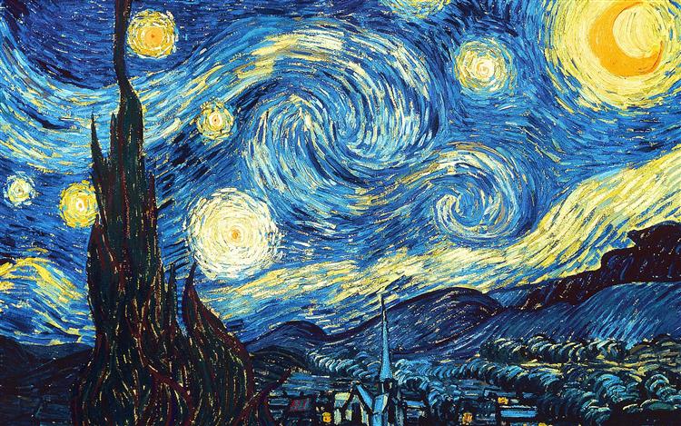
Take a look at the iconic “Starry Night” painted by Vincent Van Gogh. Some believe that his use of Citron Yellow, was meant to represent a higher power. Similar to the sun being the biggest and most important star in the Milky Way. Others believe that Van Gogh used the color to offer comfort or provide solace with his dreary and unfortunate living situation. Its this second interpretation that helps us dispel the rumors that yellow can be too bright or too loud to decorate with. The color can be used to provide a sense of calm and serenity.
Yellow is the color that resonates with the left side of the brain, helping to activate muscles, stimulate mental activity and encourages communication. It’s easy to see and produce naturally – no wonder we see the color so often throughout art history.
Decorating with bright and bold colors, especially one like yellow, is an easy way to draw attention to any part of the house. Decorating with yellow is not as difficult as you might think. When people think of yellow, a bright school bus or a yellow stop light might come first to mind. Truth be told, that yellow is far more versatile.
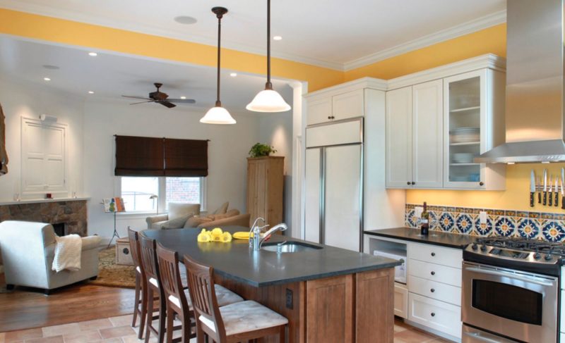
At Grossmueller’s Design we have used yellow to decorate just about every room in the house. From kitchen tile back-splash to accent walls in children’s bedrooms. Yellow is flexible and forgiving. For example, look at the tiled back-splash in the picture to the left. See the way it picks up the hue of the lower cabinets and serves as a transition between saturated lower cabinets and appliances. What about the use of yellow in this children’s bedroom below? Combined with the window sill, outlined in the same color, they create a dramatic focal point – allowing the accent wall to shine being both vibrant yet restful.
Still think Yellow is too bright or that it cries for too much attention? Yellow combined with concentrated hues of red or blue make it extremely versatile, bringing warmth and excitement to any room with colors like Babouche, Showtime, Saffron, Oucher, and Medallion. a to name a few.
Using yellow combined with a brown undertone produce a goldfish neutral, creating a sense of calm – like Honey, Granola, and Butterscotch Whether using yellow to decorate a major room or using simple accessories or minimal décor to tap into the design bring out any wall or floor enabling the space to stay cozy.
Click through the slideshow to see how Grossmuellers Design Consultants can use yellow with your design.
[pjc_slideshow slide_type=”yellow”]
This spring while you are at home thinking about what paint colors to pick for your kitchen or bathroom remodel, consider this article (along with the others in the series – Yellow, Blue)
Traditionally Valentine’s Day brings to mind red hearts, red roses, passion, chocolates and cute, chubby cherubs that strike us with an abundance of love! But we at Grossmueller’s Design think COLOR! Picking a color for your front door can be an easy face lift, yet be the toughest decision to make because it is the first impression to visitors . You want it to coordinate, be welcoming and make a statement! Remember, there is more to a color than face value…your front door actually expresses a lot of meaning.

We thought it would be fun to let you in on the meanings and history of the color red! What comes to mind when you think about the color red? Is it passion? Is it power? How about love? The color red is strongly linked to two different emotions. The first emotion is love associated with passion, sensitivity, and desire. Red is emotionally charged and intense.
The second is fire fueled by courage, energy, power, strength, danger, blood, sweat and tears. When it relates to your front door, red has taken on many other interesting meanings over the course of history.
In Chinese culture, red is considered to be the lucky or sacred color. Also, relating to Feng Shui, a red door symbolizes the mouth of the home. By painting your front door red, Chi which means positive energy, is drawn to your home. According to Chi, the front door is the spot where energy enters your house and with the color red, it will bring you abundance, opportunities and happiness.
Back in colonial America, the red door was a symbol of a safe haven and informed settlers that they were welcome there. Also, in the 19th century, red doors were used as part of the Underground Railroad, symbolizing a “safe house” for the slaves to escape to the Free states. In the modern era, red is used frequently for its high visibility – stop signs, ambulances and fire equipment.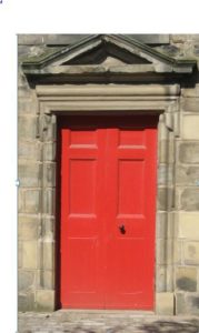
The color red also took on many religious meanings as well. In Catholicism, a red door symbolized the blood of Christ, which meant once you passed through the door, you were on holy and sacred ground. According to the Old Testament, the Jewish slaves in Egypt smeared their doors with lamb’s blood as a sign that the required sacrifice had already been made, and those homes would be passed over by the Angel of Vengeance. In Scotland people painted their doors red to indicate that their mortgages we paid off and free of any debts!
In essence, a red door represents prosperity, divine protection, good luck, and financial freedom! That sounds pretty fabulous and Grossmueller’s Design wishes you nothing short of just that.
Now you have an idea of its history, what about decorating with red? . Instead of “painting the town red,” lets discuss painting your room red.
Like yellow, red is used to draw attention and highlight elements within a room. The use of red within a design relies heavily on personal taste and design style. Transitional and contemporary designs tend to decorate with red on elements such as exterior doors, and furnishings – they work well with pale and dark neutrals―white walls, wood floors, natural stone. The more traditional styles of design will shy away from reds, with the exception of dark reds like Merlot or Burgundy on accent pieces.
Red is one of the more challenging colors to decorate an entire space with. It’s intimidating because of its intensity and too much of it can overwhelm a space leaving it feeling chaotic. The wide variety in the shades and hues of red depends on the saturation of the other primary colors (blue or yellow) Intense and passionate colors such as crimson, sangria, mahogany and ruby are excellent choices for common rooms. Meanwhile lighter colors such as apple, candy, or rose are great choices for accent walks and furniture accessories.
Designers tend to choose reds with less blue in them, because the orange is an easier color to digest. Unlike Blue, layering red requires more effort. It’s rare that you will see an entire space decorated in red. Red should be used in moderation
Obviously red attracts attention, it is frequently used in advertising Coca Cola, McDonald, Red Bull, Kellogg, Target, and Toyota.Several studies have indicated that red carries the strongest initial reaction of all the colors. Its stimulating and a statement color. If we draw a parallel, notice how we perceive the level of danger – with red being the most extreme, gradually decreasing to orange, yellow and white (stop lights, racing flag, heat index)
Using elements such as natural light, high ceilings, and complimentary neutral tones can lessen the intensity or reddish hues. As you will see in the slide show below – red, if used properly can illuminate any room in the house.
[pjc_slideshow slide_type=”decorating-with-red”]
Color Blocking, Not Just for the Runway – Color Block Your Home
We all know that fashion trends integrate into interior design trends. In fashion, the trends may come and go from spring to fall fashion weeks but consider us lucky, we interior designers get to embrace the trends in longer “blocks” of time. If you don’t know what this Color Blocking trend is all about, by definition, Color Blocking is combining different colors that support and complement each other.
For the home, Color Blocking is perfect for when you have a client that loves lots of color or desires bright color or to simply tame their need for color. It is a way of supporting your client’s lively requests for color without looking like rainbow bright! (Please note: Color Blocking is ideal for an open floor plan so the whole effect can be seen from multiple points in the home).
The way to achieve this look is to pick a neutral base color for the majority of the walls. It can be a warm ivory, a white, or even a light gray. You want this neutral color to be light enough that it doesn’t read as a color but saturated, just enough, to hold the “visual weight” of all the different colors surrounding it. When picking your walls for Color Blocking, think about which walls are the focal point in the space and use good transition walls (walls that connect one space to another).
When selecting the colors, really listen to your client. Find out what their favorite colors are and colors that they are comfortable living with day in and day out! Helpful hint – look at what they wear. This will give you a shoe-in to picking “livable” colors for them. Now the fun part – Color Blocking! We suggest picking one bright, saturated color. Then color block with supporting colors that are two tones down from that. Find supporting colors that have a slight brown or gray undertone to them. It will help eliminate the intensity of all this fun color around you. Remember, this is your home not a circus.
Here is an easy trick when pairing colors together. The color wheel is your go to! Select colors that are neighbors to each other – keeping it in the family. Then pick a complimentary color that is across the color wheel. By using this little trick, you will be successful in your color choices. Happy Color Blocking!

Don’t just take our word for it. Have a look at what other people, magazines, and leading industry professionals are saying about the quality of work and design at Grossmuellers Design Consultants!

http://www.narimetrodc.org/flashback-friday-customized-condo/
Home Advisor
http://www.homeadvisor.com/r/aging-at-home-problems-solutions/#.VyN3JPkrKUl
National Association for the Remodeling Industry (NARI)
blog : NARI Metro DC Chapterhttp://www.narimetrodc.org/category/blog/This basement remodel is fitted with several elements to entertain family and guests in the comfort of the client’s home. First, the curved wood bar with granite top, bar…
COTY Awards : NARI Metro DC Chapterhttp://www.narimetrodc.org/coty-award/The NARI Metro DC Contractor of the Year (Capital CotY) Awards are this area’s most prestigious award in the field of home remodeling, design, creativity and problem solving.…
Qualified Remodeler and Kitchen & Bath Design News

Grossmueller’s Design Consultants in Washington, DC specializes in detail work and the design of kitchen and baths for remodeling. | Kitchen Bath Design Newshttp://www.kitchenbathdesign.com/business/industry-profiles/article/10919075/grossmuellers-design-consultants-in-washington-dc-specializes-in-detail-work-and-the-design-of-kitchen-and-baths-for-remodelingWhen it comes to home remodeling today, the goal is to make a room both beautiful and functional. Room designs need to fit the personality of the homeowner…
DC, MD, VA – Home & Design
The DC Design House Returns | H&D STYLE INSIDER BLOGhttps://homeanddesigndcmdva.wordpress.com/2014/04/11/the-dc-design-house-returns/ On Tuesday—a perfectly crisp and sunny early spring day—the 2014 DC Design House opened its doors to the press. This year, 29 spaces were transformed, and the results are stunning. Many des…
http://www.homeanddesign.com/2014/06/05/show-house-dazzle
Bathroom renovation tips | Stuff.co.nzhttp://www.stuff.co.nz/life-style/home-property/10053322/Bathroom-renovation-tipsCindy McClure, who works her aesthetic magic at Washington firm Grossmueller’s Design, is one of the US’ top interior designers. Here she answers questions about renovating…