Interior design can be complicated. There is a vast amount of knowledge that the top designers and architects have contributed and shared across the internet. What makes an award winning kitchen? Who determines what design styles are “in” or “out?” Regardless of your experience with interior design or remodeling, there are seven concepts s to know. These basics will help you spot trendy and well put together designs. The Elements of Design and the Principles of Design are the fundamental tools that your interior designer carries with them in their tool bag (move over hot sauce.)
This blog post will cover the Elements of Design. These five concepts are considered the building blocks of design. You will see them in every work of art including paintings, sculptures, and of course interior design.
- Line: The simplest and easiest of the five elements. Look at what you already know about Lines. All of them are straight, and go from one point to another. They can vary in width, go up, down, right or left, be dotted or jagged.Drawing a line on an art medium isn’t much different than how designers and architects use them. Of course they use them to create drawings and elevations in the BUILDING of the space… but what about the things that goes INTO the space like carpeting, paint, and furniture? An Interior Designer, much like a painter wants you to feel and interpret the space in a certain way. Sight lines are used to create visual and physical aesthetics in a space to have your eyes follow a path, better known as the natural flow of a room. Look at the below photo. First impression: where do your eyes land and where do they go as you explore the rest of the room?
- Shape/Form Simply put shapes are the intersections of lines which enclose a space. When we think about shapes, mostly likely the we think of the geometric variety we learned in grade school – squares, triangles, and circles, however, there are other types as well. Organic shapes such as seashells, flowers and leaves are naturally occurring and when implemented into a design, can bring about emotions and memoriesIt should be noted here, that shapes are a two dimensional object. FORM is a three dimensional shape.
- Texture: Is it rough, jagged, smooth? Texture can be real or implied. Real is how the object actually feels against your skin. Implied is like a photograph of sandpaper–while on a smooth piece of paper still “feels” rough. The texture is implied yet felt. This technique of adding visual weight makes you FEEL the room.
- Color: What our eyes see due to the reflection of light through different wavelengths. Rainbows are a perfect example of how color works. (More on color theory/blocking soon) There are over 10,000 colors and hues the human eye recognizes. From the first days of human, color has been used as an expression of emotion. The subsequent generations have expanded color theory into a science with results of certain colors and their effects on the brain. Color generates excitement, feelings of calm, and change perception of a room.
- Space: The area around or in an object or work of art. Negative space, the term you are probably most familiar with is the concept of the blank (or white) space in an email or drawing. Negative space is under appreciated. It makes images or designs larger or smaller.
Decorating with Yellow –
This spring while you are at home thinking about what paint colors to pick for your kitchen or bathroom, consider this article (along with the others in the series, Blue, Red) about the power of color.
Arguably, one of the most important colors in the color spectrum is Yellow (which is why we chose it to start this blog series.) Nature reinforces its importance, notice that it’s a primary color along with red and blue (RYB) and the colors we use in our printers (Cyan, Magenta, Yellow and Key-Black.
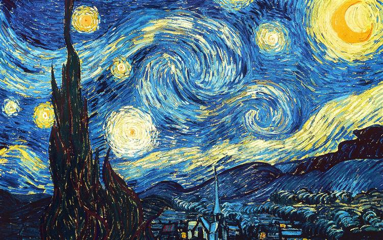
Take a look at the iconic “Starry Night” painted by Vincent Van Gogh. Some believe that his use of Citron Yellow, was meant to represent a higher power. Similar to the sun being the biggest and most important star in the Milky Way. Others believe that Van Gogh used the color to offer comfort or provide solace with his dreary and unfortunate living situation. Its this second interpretation that helps us dispel the rumors that yellow can be too bright or too loud to decorate with. The color can be used to provide a sense of calm and serenity.
Yellow is the color that resonates with the left side of the brain, helping to activate muscles, stimulate mental activity and encourages communication. It’s easy to see and produce naturally – no wonder we see the color so often throughout art history.
Decorating with bright and bold colors, especially one like yellow, is an easy way to draw attention to any part of the house. Decorating with yellow is not as difficult as you might think. When people think of yellow, a bright school bus or a yellow stop light might come first to mind. Truth be told, that yellow is far more versatile.
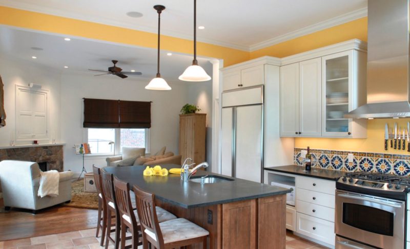
At Grossmueller’s Design we have used yellow to decorate just about every room in the house. From kitchen tile back-splash to accent walls in children’s bedrooms. Yellow is flexible and forgiving. For example, look at the tiled back-splash in the picture to the left. See the way it picks up the hue of the lower cabinets and serves as a transition between saturated lower cabinets and appliances. What about the use of yellow in this children’s bedroom below? Combined with the window sill, outlined in the same color, they create a dramatic focal point – allowing the accent wall to shine being both vibrant yet restful.
Still think Yellow is too bright or that it cries for too much attention? Yellow combined with concentrated hues of red or blue make it extremely versatile, bringing warmth and excitement to any room with colors like Babouche, Showtime, Saffron, Oucher, and Medallion. a to name a few.
Using yellow combined with a brown undertone produce a goldfish neutral, creating a sense of calm – like Honey, Granola, and Butterscotch Whether using yellow to decorate a major room or using simple accessories or minimal décor to tap into the design bring out any wall or floor enabling the space to stay cozy.
Click through the slideshow to see how Grossmuellers Design Consultants can use yellow with your design.
[pjc_slideshow slide_type=”yellow”]
 “I guess it goes to show that you just never know where life will take you. You search for answers. You wonder what it all means. You stumble, and you soar. And, if you’re lucky, you make it to Paris for a while.”
― Amy Thomas, Paris, My Sweet: A Year in the City of Light
Well, it just so happened that life took one of our clients on a vacation and they were lucky enough to travel to Paris, France. In midst of their trip, they stumbled into a Parisian café where the couple fell in love with the décor, the warm colors, textures and the intricate details in the tile work. They knew instantly that this “look” was exactly what the
y wanted for their kitchen remodel. The client came to Grossmueller’s Design with their their ideas and photos and we made their dream kitchen become a reality.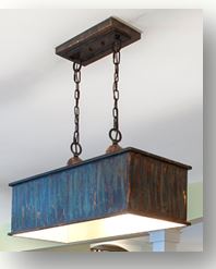
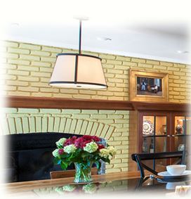
In Parisian style décor, it conveys heavy emphasis on the details and on the quality of the furnishings, followed by function. Starting on a smaller scale but has major impact, we designed a custom hexagon tile floor. It includes terracotta and cream colored rosettes in the center with a decorative border tying in green and black, on a crisp, white background. Each tile was hand laid, giving the floor that old world feel. Keeping with the artisan touch, Grossmueller’s Design specified custom cabinets with two-toned wooden stains with black painted beading in between the two finishes to add that “furniture-like” feel that is a classic trait in Parisian kitchens. These cabinets create a strong focal point in the kitchen yet allow for the other visual textures and finishes to resonate beautifully together. Balancing off the cabinets is the original, brick fireplace. We updated the brick by painting it a warm, creamy yellow and added custom built-ins with glass doors that complement the kitchen cabinets. This provides functional storage yet allows for the client to beautifully display their art and collectibles at the same time. Style and function!
To keep with the character of the Parisian theme, we paid close attention to the finishes and accessories. From the porcelain farm sink to the white subway tile for the backsplash to the custom hammered hood above the stove to the oxidized copper pendant hanging above the large, working island to the barley engraved, glass pantry door. All these items combined add that old world character that encompasses the Parisian style that our client was greatly looking to achieve. Now they get to experience a Parisian café every day and their fond memories, old and new. We at Grossmueller’s Design encourage you to surround yourself in a home that you love. And if you’re not quite sure how to achieve that, we would be happy to help make your dream home become a reality. Au revoir!
Deciding to Move or Improve
Should we move or should we improve? This age old question is one that ultimately arises when contemplating a renovation. While somewhat protected in the Washington DC market, for the rest of the country, the question becomes even more challenging in today’s economy with lots of factors to consider.
For most, it seems like overnight, the house suddenly feels too small or too large, or your family needs change. Sometimes an older home’s layout doesn’t suit your particular needs, or maybe you have been in the house for a number of years and it’s time for some cosmetic changes. These are just a few of the most common reasons why people consider change.
In meeting with people facing this decision, we advise them to take some time to themselves, sit down with a pad of paper in hand and create a two-column chart. The first column should list all the factors that would play into a decision to move. Personal factors include your neighborhood, schools, and commute. Budget factors include moving costs, real estate commissions, repair costs of your old and new homes, decorating expenses, possible changes in interest rates, and finally the additional cost of the new mortgage. Don’t forget to factor in time—time spent looking for a new home plus time spent selling yours.
In the second column list all the factors that would play into a decision to improve. Many of the personal factors listed above will remain the same, list them. List your likes and dislikes about the house. Determine what it would minimally take to make your home more functional and what would be your most extravagant dream home? How long do you intend on staying in the house? What are your families’s evolving needs going to be? Budget factors will have many variables; how much you are willing to do yourself and how much will the neighborhood bear are starting points to establish a budget that is comfortable for you. Many newsstand home improvement magazines discuss costs of typical projects based on regions of the country. Use these as tools to help determine if the budget you have established for yourself jives with the reality of market cost. What is your borrowing power? What will your involvement be in the process and finally, again, don’t forget to factor in time—time spent selecting a designer/architect, contractor and products, and time spent under construction.
The next step is to assign value to each factor on a scale of 1-10 and then total each column. While it may seem simple, this logical process is only a starting point. It cannot take into account the emotional reactions you will have to either experience. Both moving and improving can be an adventure or a headache, depending on how you look at it. How flexible are you and what your tolerance level is–may actually become factors in your chart. Don’t let the possibilities overwhelm you, use this as a stepping stone to open conversations about what works best for you!
Color Blocking, Not Just for the Runway – Color Block Your Home
We all know that fashion trends integrate into interior design trends. In fashion, the trends may come and go from spring to fall fashion weeks but consider us lucky, we interior designers get to embrace the trends in longer “blocks” of time. If you don’t know what this Color Blocking trend is all about, by definition, Color Blocking is combining different colors that support and complement each other.
For the home, Color Blocking is perfect for when you have a client that loves lots of color or desires bright color or to simply tame their need for color. It is a way of supporting your client’s lively requests for color without looking like rainbow bright! (Please note: Color Blocking is ideal for an open floor plan so the whole effect can be seen from multiple points in the home).
The way to achieve this look is to pick a neutral base color for the majority of the walls. It can be a warm ivory, a white, or even a light gray. You want this neutral color to be light enough that it doesn’t read as a color but saturated, just enough, to hold the “visual weight” of all the different colors surrounding it. When picking your walls for Color Blocking, think about which walls are the focal point in the space and use good transition walls (walls that connect one space to another).
When selecting the colors, really listen to your client. Find out what their favorite colors are and colors that they are comfortable living with day in and day out! Helpful hint – look at what they wear. This will give you a shoe-in to picking “livable” colors for them. Now the fun part – Color Blocking! We suggest picking one bright, saturated color. Then color block with supporting colors that are two tones down from that. Find supporting colors that have a slight brown or gray undertone to them. It will help eliminate the intensity of all this fun color around you. Remember, this is your home not a circus.
Here is an easy trick when pairing colors together. The color wheel is your go to! Select colors that are neighbors to each other – keeping it in the family. Then pick a complimentary color that is across the color wheel. By using this little trick, you will be successful in your color choices. Happy Color Blocking!
