Decorating with Yellow –
This spring while you are at home thinking about what paint colors to pick for your kitchen or bathroom, consider this article (along with the others in the series, Blue, Red) about the power of color.
Arguably, one of the most important colors in the color spectrum is Yellow (which is why we chose it to start this blog series.) Nature reinforces its importance, notice that it’s a primary color along with red and blue (RYB) and the colors we use in our printers (Cyan, Magenta, Yellow and Key-Black.

Take a look at the iconic “Starry Night” painted by Vincent Van Gogh. Some believe that his use of Citron Yellow, was meant to represent a higher power. Similar to the sun being the biggest and most important star in the Milky Way. Others believe that Van Gogh used the color to offer comfort or provide solace with his dreary and unfortunate living situation. Its this second interpretation that helps us dispel the rumors that yellow can be too bright or too loud to decorate with. The color can be used to provide a sense of calm and serenity.
Yellow is the color that resonates with the left side of the brain, helping to activate muscles, stimulate mental activity and encourages communication. It’s easy to see and produce naturally – no wonder we see the color so often throughout art history.
Decorating with bright and bold colors, especially one like yellow, is an easy way to draw attention to any part of the house. Decorating with yellow is not as difficult as you might think. When people think of yellow, a bright school bus or a yellow stop light might come first to mind. Truth be told, that yellow is far more versatile.
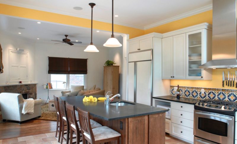
At Grossmueller’s Design we have used yellow to decorate just about every room in the house. From kitchen tile back-splash to accent walls in children’s bedrooms. Yellow is flexible and forgiving. For example, look at the tiled back-splash in the picture to the left. See the way it picks up the hue of the lower cabinets and serves as a transition between saturated lower cabinets and appliances. What about the use of yellow in this children’s bedroom below? Combined with the window sill, outlined in the same color, they create a dramatic focal point – allowing the accent wall to shine being both vibrant yet restful.
Still think Yellow is too bright or that it cries for too much attention? Yellow combined with concentrated hues of red or blue make it extremely versatile, bringing warmth and excitement to any room with colors like Babouche, Showtime, Saffron, Oucher, and Medallion. a to name a few.
Using yellow combined with a brown undertone produce a goldfish neutral, creating a sense of calm – like Honey, Granola, and Butterscotch Whether using yellow to decorate a major room or using simple accessories or minimal décor to tap into the design bring out any wall or floor enabling the space to stay cozy.
Click through the slideshow to see how Grossmuellers Design Consultants can use yellow with your design.
[pjc_slideshow slide_type=”yellow”]
 “I guess it goes to show that you just never know where life will take you. You search for answers. You wonder what it all means. You stumble, and you soar. And, if you’re lucky, you make it to Paris for a while.”
― Amy Thomas, Paris, My Sweet: A Year in the City of Light
Well, it just so happened that life took one of our clients on a vacation and they were lucky enough to travel to Paris, France. In midst of their trip, they stumbled into a Parisian café where the couple fell in love with the décor, the warm colors, textures and the intricate details in the tile work. They knew instantly that this “look” was exactly what the
y wanted for their kitchen remodel. The client came to Grossmueller’s Design with their their ideas and photos and we made their dream kitchen become a reality.
In Parisian style décor, it conveys heavy emphasis on the details and on the quality of the furnishings, followed by function. Starting on a smaller scale but has major impact, we designed a custom hexagon tile floor. It includes terracotta and cream colored rosettes in the center with a decorative border tying in green and black, on a crisp, white background. Each tile was hand laid, giving the floor that old world feel. Keeping with the artisan touch, Grossmueller’s Design specified custom cabinets with two-toned wooden stains with black painted beading in between the two finishes to add that “furniture-like” feel that is a classic trait in Parisian kitchens. These cabinets create a strong focal point in the kitchen yet allow for the other visual textures and finishes to resonate beautifully together. Balancing off the cabinets is the original, brick fireplace. We updated the brick by painting it a warm, creamy yellow and added custom built-ins with glass doors that complement the kitchen cabinets. This provides functional storage yet allows for the client to beautifully display their art and collectibles at the same time. Style and function!
To keep with the character of the Parisian theme, we paid close attention to the finishes and accessories. From the porcelain farm sink to the white subway tile for the backsplash to the custom hammered hood above the stove to the oxidized copper pendant hanging above the large, working island to the barley engraved, glass pantry door. All these items combined add that old world character that encompasses the Parisian style that our client was greatly looking to achieve. Now they get to experience a Parisian café every day and their fond memories, old and new. We at Grossmueller’s Design encourage you to surround yourself in a home that you love. And if you’re not quite sure how to achieve that, we would be happy to help make your dream home become a reality. Au revoir!
Don’t just take our word for it. Have a look at what other people, magazines, and leading industry professionals are saying about the quality of work and design at Grossmuellers Design Consultants!

http://www.narimetrodc.org/flashback-friday-customized-condo/
Home Advisor
http://www.homeadvisor.com/r/aging-at-home-problems-solutions/#.VyN3JPkrKUl
National Association for the Remodeling Industry (NARI)
blog : NARI Metro DC Chapterhttp://www.narimetrodc.org/category/blog/This basement remodel is fitted with several elements to entertain family and guests in the comfort of the client’s home. First, the curved wood bar with granite top, bar…
COTY Awards : NARI Metro DC Chapterhttp://www.narimetrodc.org/coty-award/The NARI Metro DC Contractor of the Year (Capital CotY) Awards are this area’s most prestigious award in the field of home remodeling, design, creativity and problem solving.…
Qualified Remodeler and Kitchen & Bath Design News

Grossmueller’s Design Consultants in Washington, DC specializes in detail work and the design of kitchen and baths for remodeling. | Kitchen Bath Design Newshttp://www.kitchenbathdesign.com/business/industry-profiles/article/10919075/grossmuellers-design-consultants-in-washington-dc-specializes-in-detail-work-and-the-design-of-kitchen-and-baths-for-remodelingWhen it comes to home remodeling today, the goal is to make a room both beautiful and functional. Room designs need to fit the personality of the homeowner…
DC, MD, VA – Home & Design
The DC Design House Returns | H&D STYLE INSIDER BLOGhttps://homeanddesigndcmdva.wordpress.com/2014/04/11/the-dc-design-house-returns/ On Tuesday—a perfectly crisp and sunny early spring day—the 2014 DC Design House opened its doors to the press. This year, 29 spaces were transformed, and the results are stunning. Many des…
http://www.homeanddesign.com/2014/06/05/show-house-dazzle
Bathroom renovation tips | Stuff.co.nzhttp://www.stuff.co.nz/life-style/home-property/10053322/Bathroom-renovation-tipsCindy McClure, who works her aesthetic magic at Washington firm Grossmueller’s Design, is one of the US’ top interior designers. Here she answers questions about renovating…